UX Improvement Tasks
Mission
This section showcasing three UX tasks that I have been involved at WVC ( World Vision Canada). These works were assigned to me based on information gathered from different user groups.
What I Have Accomplished
World Vision Canada's Child Sponsorship website UI was able to distinguish themselves from their look-a-like style seen from Compassion Canada's corporate website.
A Global Header Style guide was created to unify the style of various microsites seen from WVC's corporate website.
A web colour contrast guide was created to help WVI (World Vision international) branding team understand the importance of AODA compliance when creating the new branding materials.
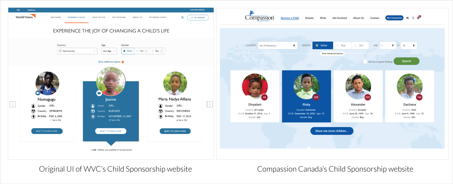
When WVC's new Child Sponsorship website was completed by an outsourcing web development agency, it was apparent that the new web UI and layout was very similar to the Child Sponsorship website powered by Compassion Canada. I was given a task to make some design adjusment so that the two websites will distinguish more from each other in terms of visual appearence.
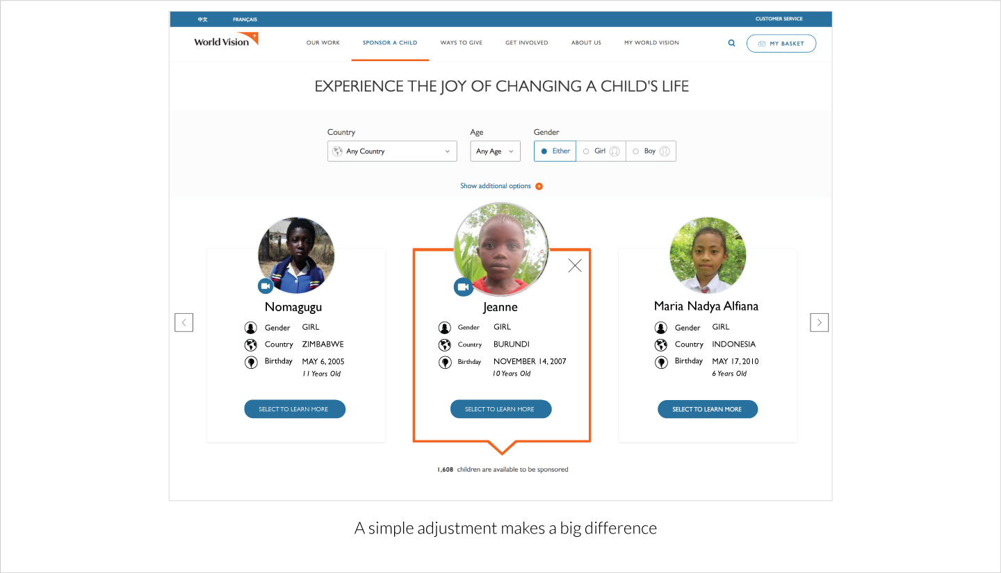
After some brainstorming sessions with project managers and manager of Web Development and Digital Experience, we think the simple adjustment to the css for the button rollover effect will be the best solution to this problem. That is, instead of using a blue filled background on mouse rollover, use a thick simple orange border for the child info plate and set the background colour to white.
This simple solution saves a lot money without having the oursourcing web development agency to re-design the web UI.
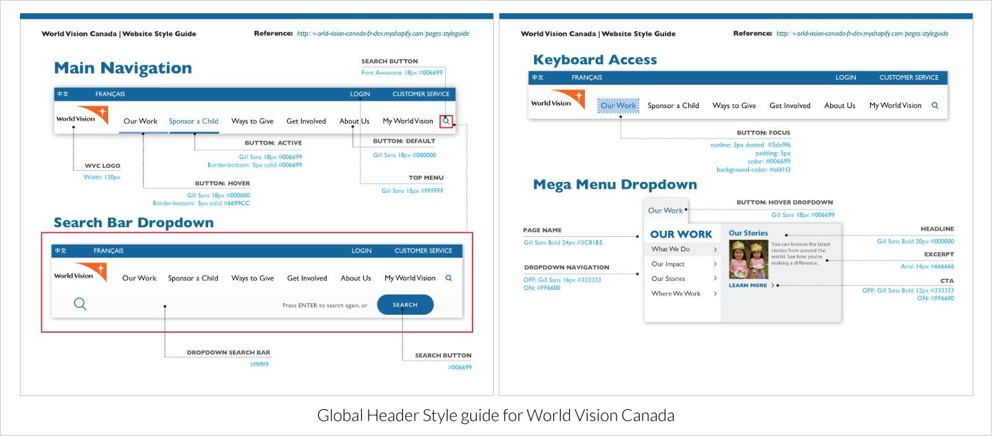
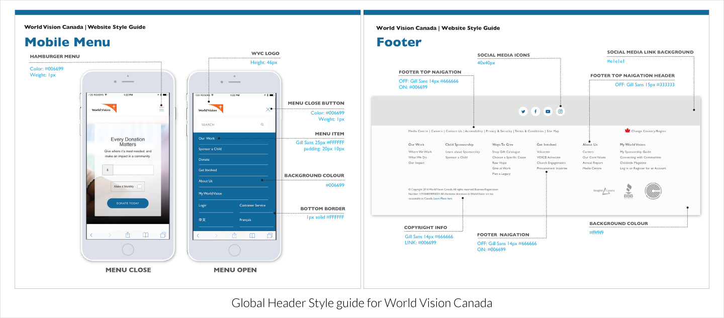
There are many micorsites created on World Vision Canada's corporate website and since they were all managed by different project managers the overall appearence were often varies in style across different microsites. I was assigned a task to create a global header style guide for front end web developers so that they can apply the same header styles for every microsites found on WVC's main website. I have also specified some additional accessibility related CSS properties such as button focus state to help improving the accessibility of the websites.

Create a colour matrix chart based on the combination of the new WVI (World Vision International) branding colours.
Many of these colours were not web ready due to low level of colour contrast ratio. This chart was created to demostrate the importance of web colour accessibility and in turn convinced the brand team in permitting us, the digital experience team, to choose other alternative colour schemes that will meet the requirements of the AODA compliance.

A brief visual compareson between the orginal Secondary brand colours for print and their alternative selections for digital products.