Pro Xtra UI Design Project
Mission
Pro Xtra is a royalty program that Home Depot offers for customer who shops at the store on regular basis. The program benefits members in appreciation of their commercial business with the company. All members receive purchase tracking when they use their Pro Xtra ID to accumulate reward points for gift card, fuel savings and other benefits.
My task was to help design and create the web UI for the online sign up process of the Pro Xtra program.
What I Have Accomplished
Work closely with UX designer, product owner, business analysts and other key members of UX Design Team to understand the business process and requirements in order to design the most effective user interfaces.
My Role
As a UI Designer, I was responsible for designing and creating high fidelity mockups and visual graphic assets of the new UI Design. All UI design has to adhere The Home Depot Canada/homedepot.ca design standards by following the digital style guide for all elements, such as buttons, fonts, forms, tables, colors, icons and navigation etc.
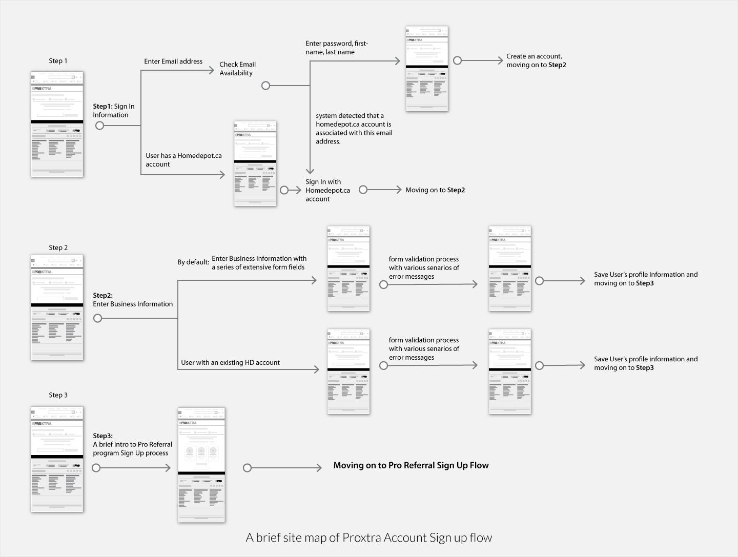
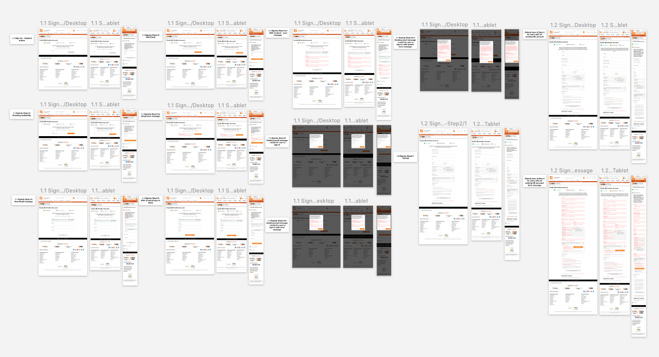
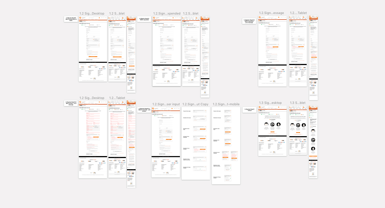
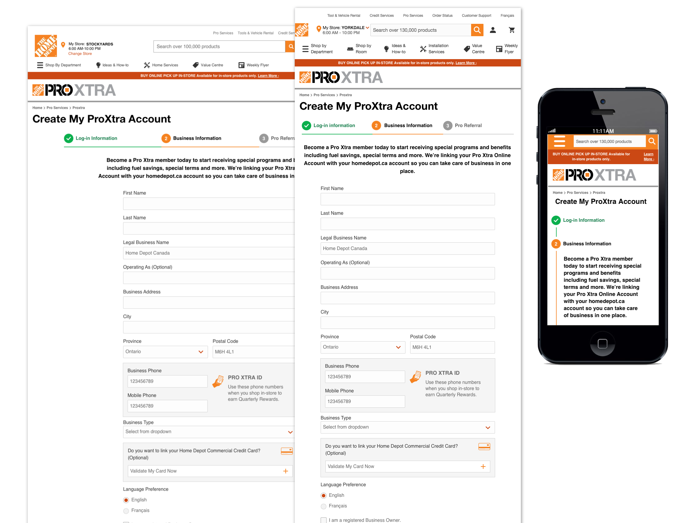
The above picture is about 8% zoomed out screen of the original screen size, it shows some examples of web UI mockups that I have done in Sketch software for Home Depot's ProXtra program sign-up flow. Each section of the mockup symoblizes the a unique senario when user is interacting with the website. Each senario will be designed and created based on 3 different break points for 3 different devices; desktop, tablet and mobile screens.
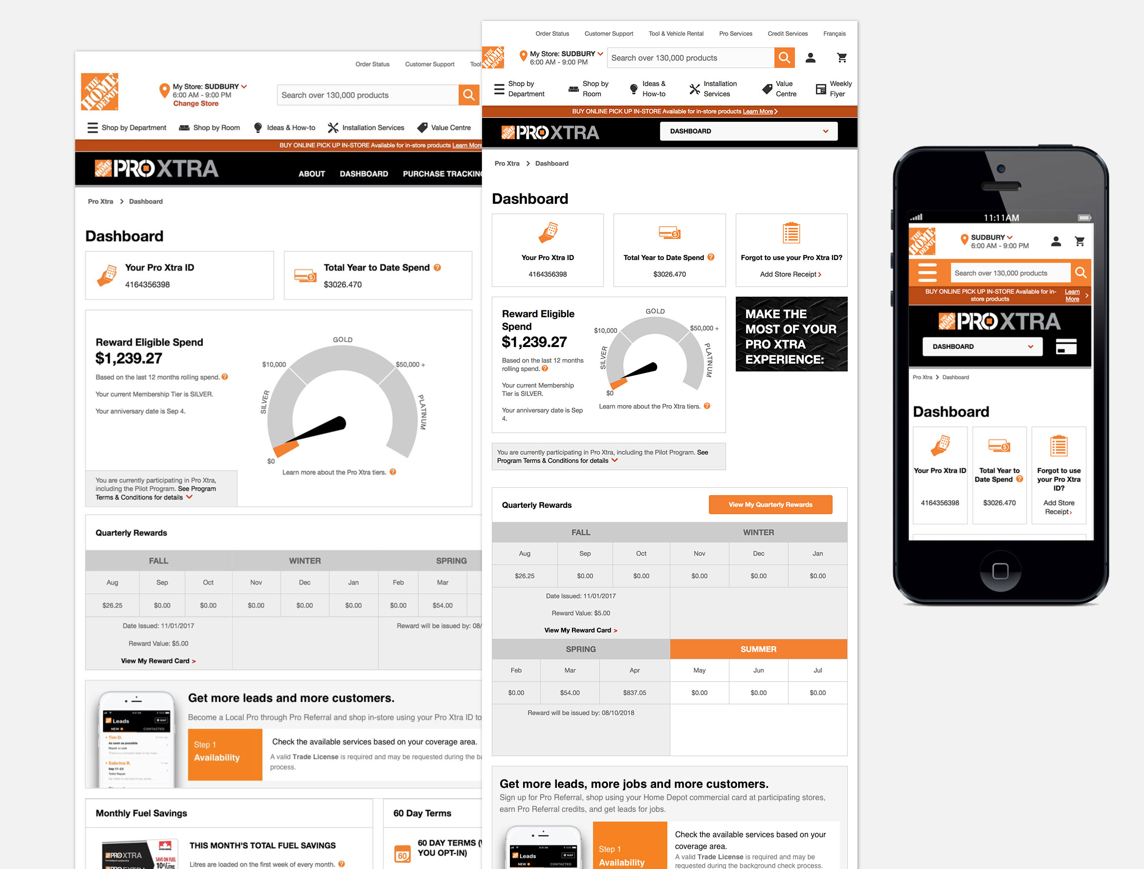
Above are work samples of the web UI design that I have done for Pro Xtra website.
The above diagram is a good example to show the process of designing a section of a web page UI. For instance, this is the 2nd step of ProXtra sign-up process where the user is asked to provide their business information such as legal business name, address of the office, type of business and etc.
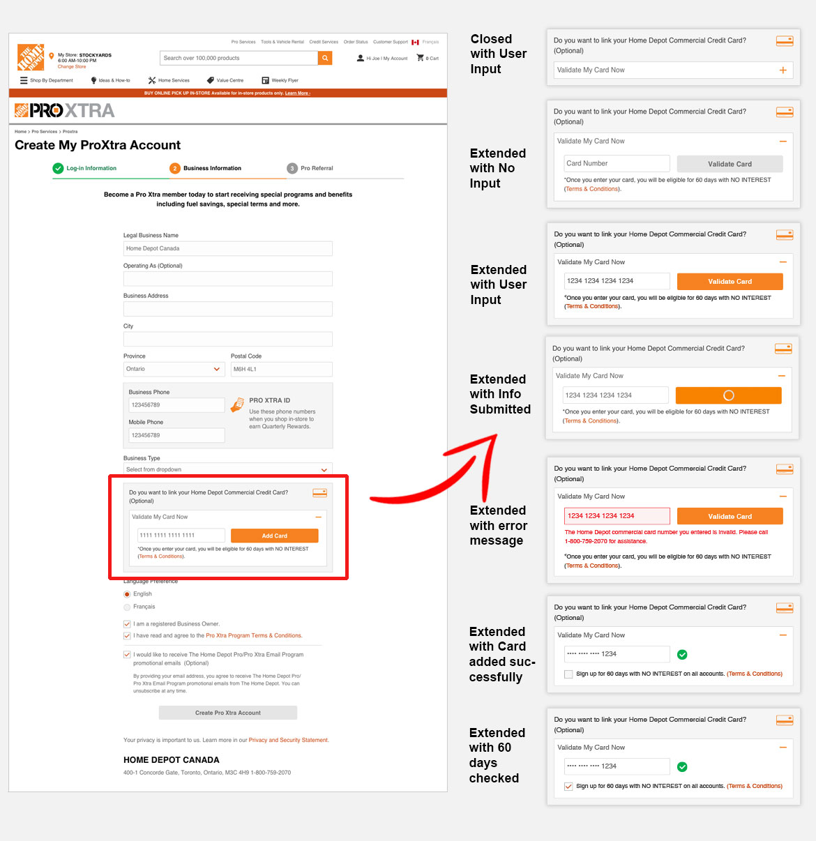
In this particular section of the form, the user is also asked on whether she/he would like to link their Home Depot Commercial Credit Card to their ProXtra account. As a UI/UX designer, I have to think about different senarios of the interaction between the form and user. Once a credit card number has been filled, the system will check to validate the card first. In this case, there are 6 conditions or instances of the form responding to the credit card information that is being entered by the user.
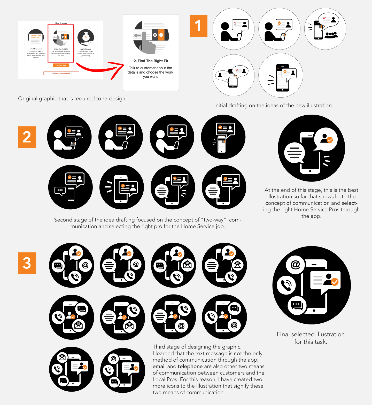
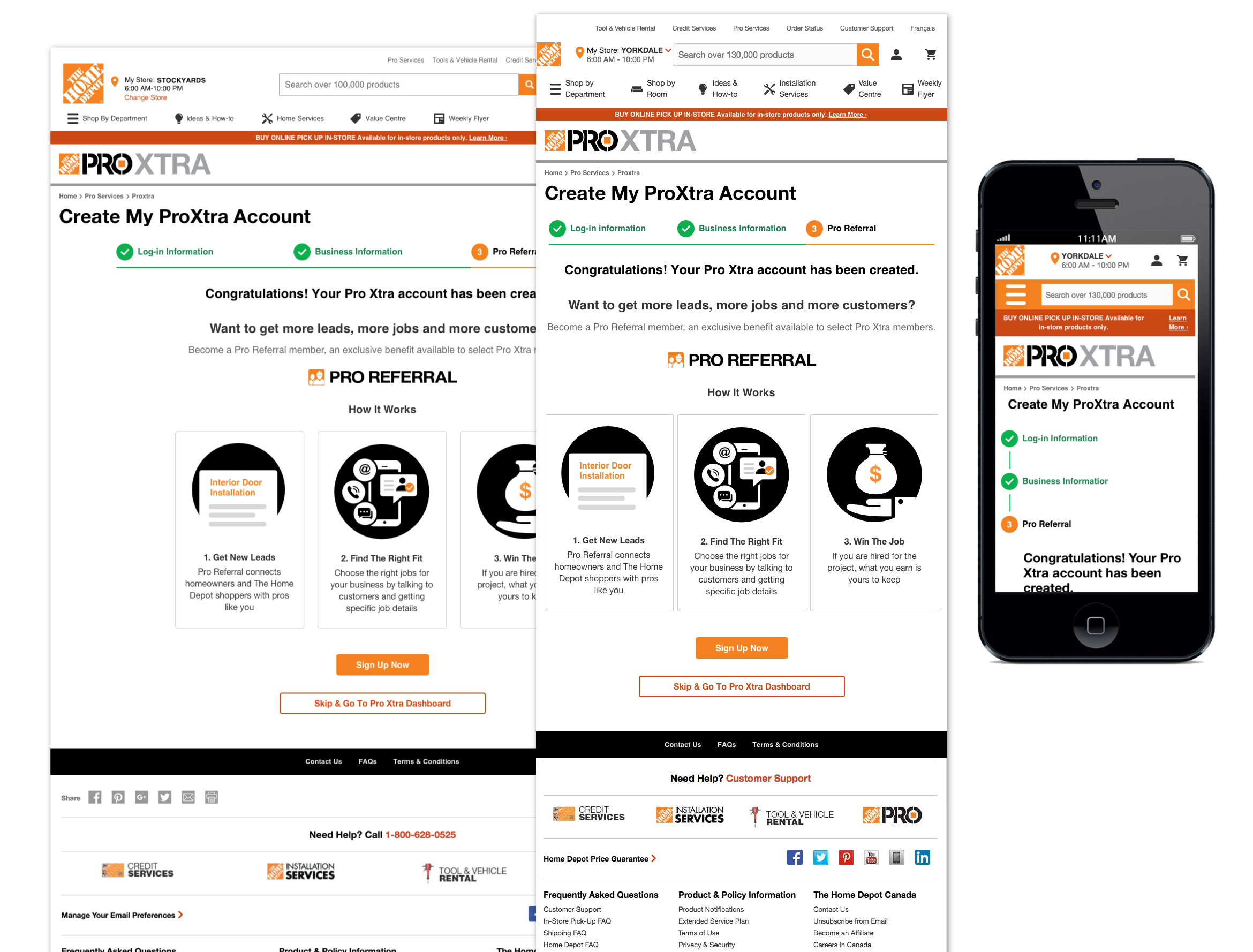
As a UI Designer at Home Depot, I also need to take on many visual design tasks to enhance the look and feel of website interface. For instance, there is an illustration that advertise how Home Depot's Pro Referral App can help local pros finding a right fit for their job through the commnication means of the app interacting with potential clients.
Above info graphic explains how the design process was when I was working on this particular illustration.